
We ❤️ NYC
A Tale of Two (Three?) Logos
The astute reader may be wondering why this week’s edition of Rat Report came out on Friday rather than on Thursday. The astute reader may also notice that we have a fancy new logo thanks to our talented friend Diego. Because this week’s edition is all about logos we decided to unveil them all at once.
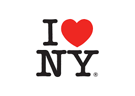
On the topic of logos, New York City recently released a new “We ❤️ NYC” logo to replace the iconic “I ❤️ NY” logo.
Why, you might ask, did the city spend time and money redesigning a logo that didn’t need to be redesigned, only to make it worse?
We have no idea, and neither does anyone else.
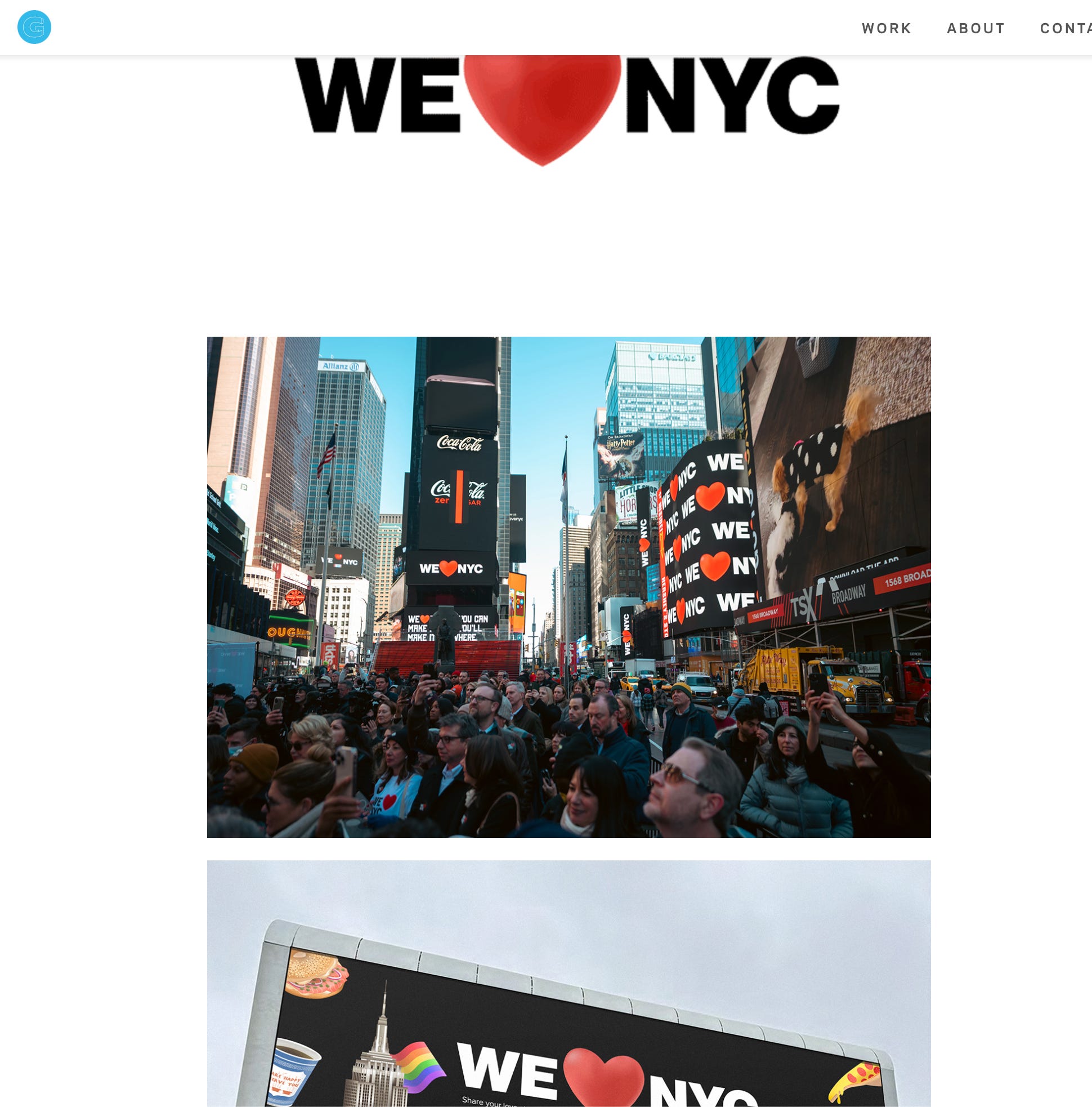
The original:
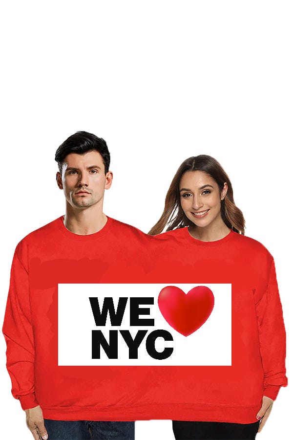
The new version:
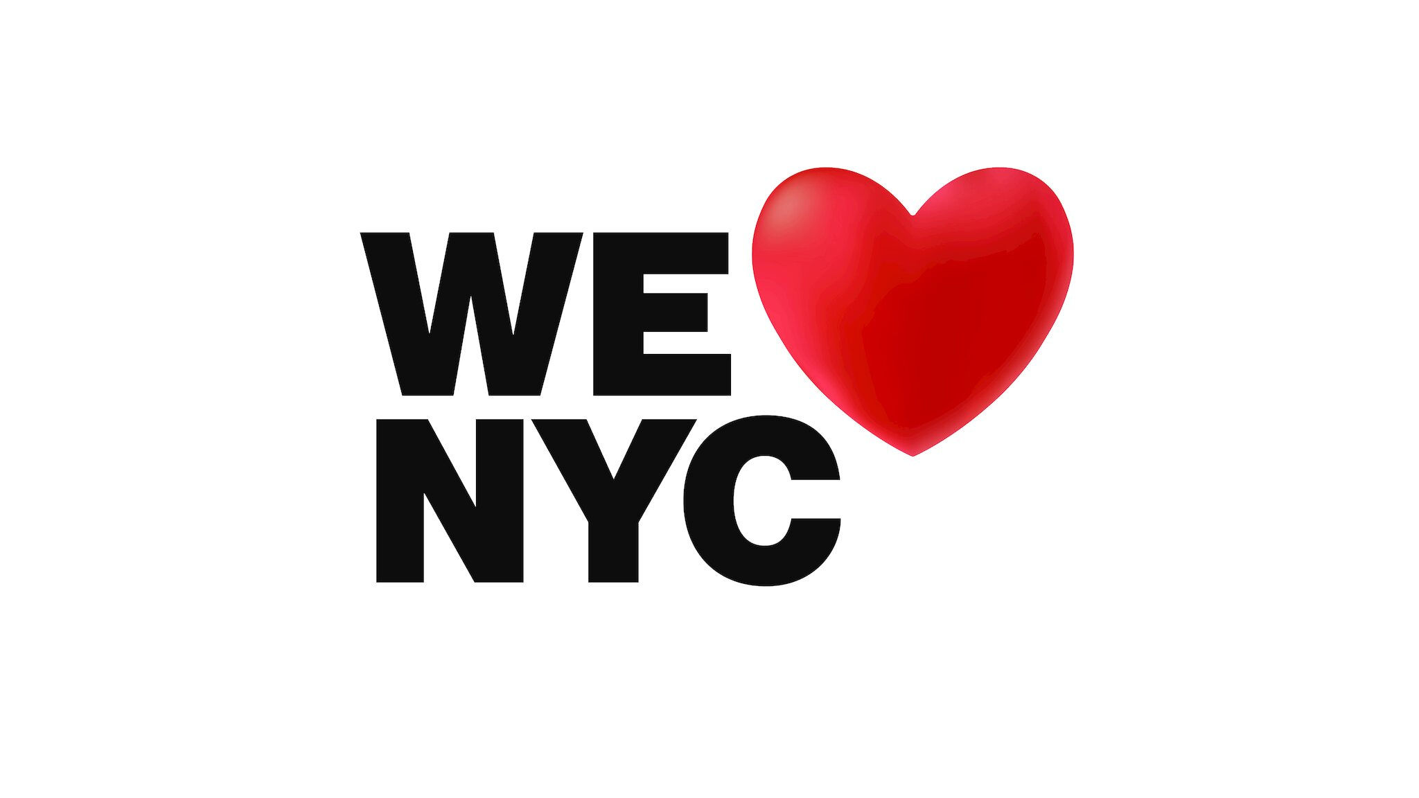
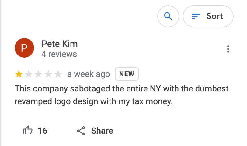
The astute reader may be asking themselves, “what the fuck is this?” Many residents of New York City had the same reaction.
Why is it so off-balance and lopsided? It looks like someone typed “WE NYC” in Microsoft Word and pasted a clip art heart next to the letters without bothering to align or resize anything.
But more importantly, why? The original was iconic, timeless, and immediately recognizable, while the new one just looks like words and an emoji. It’s essentially the same thing, but with a few dumb, arbitrary changes.
BUT WAIT, claims the designer, the new logo is special because the font is actually inspired by the font used on NYC subway signs!
So, just plain letters? Someone should tell the designer that the NYC subway signs use the most plain, unrecognizable font in existence. Not a single person in the entire universe laid eyes on the new logo and said, “hey, that’s the same font that the NYC subway signs use!”

Besides, is the subway the part of the city I want to remember whenever I look at the logo? Do I want a constant reminder that my daily commute requires me to descend into a dirty tunnel like the Vietcong?
Next, the designer and city officials changed the words for no real reason.
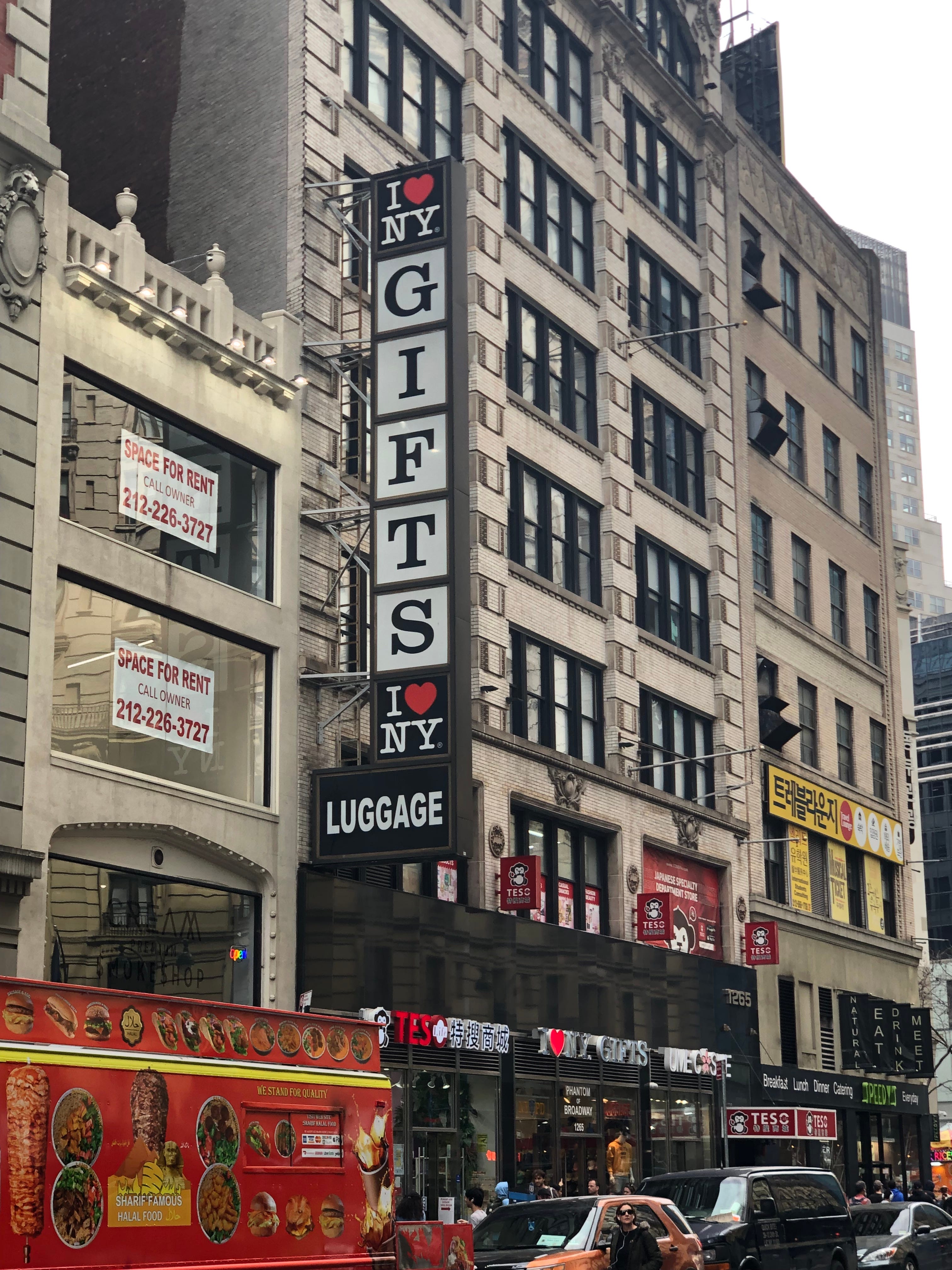
They replaced “I” with “WE,” presumably as a low-effort way to appear more inclusive by pretending that individuals no longer exist, just a collective “WE.” The problem with this is that the logo exists primarily to print on t-shirts to sell to tourists at Midtown gift shops.
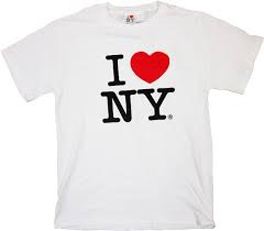
You can buy the shirt above at one of the many gift shops like the one depicted below.
T-shirts are typically worn by a single person at a time, so an “I ❤️ NY” logo makes sense, while a “WE ❤️ NYC” logo does not. Who is “WE” when worn on a t-shirt? My only theory is that Mayor Adams has cornered the market on shirts for Siamese twins.
However, in the same redesign focused on inclusion, they changed “NY” to “NYC,” thereby excluding the rest of the state from WE’s love with one swipe of the pen. Was it worth redesigning the logo just to tell Long Island that we don’t love them? They knew that already.
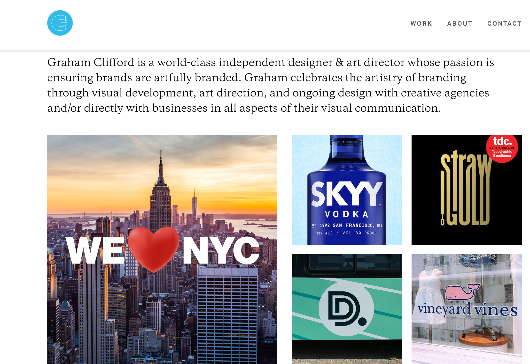
So who is responsible for the new logo? The designer’s name is Graham Clifford, the designer behind the Vineyard Vines logo. Who better to ruin a logo for the city than someone who convinced an entire generation of assholes to pay $50 for a sweatshop t-shirt emblazoned with a smiling whale? Clifford, who has lived in New York City for 30 years but still writes “honour,” published a LinkedIn post blaming city officials for the disastrous logo, essentially claiming they gave him an impossible task, and rather than turning down the assignment he just created something that everyone hates.
He also claims that his logo is not meant to replace the original logo, but to “complement” it. This makes me wonder why his logo is basically the same thing as the original, only worse.
Clifford’s website shows only modified, horizontal versions of the new logo, as if he’s trying to pretend he didn’t design the lopsided monstrosity and that the logo was meant to be horizontal all along. It only shows the lopsided version in very small or blurry images.
You know a logo is bad when the designer is trying to distance himself from the final product which is being used by the city, and then writes social media posts blaming city officials for the end result.
In his LinkedIn post, Clifford writes that he hopes that all the “energy” (read: anger) around his new logo is channeled into constructive community action, inspiring New Yorkers to “clean up a common area, help at a soup kitchen, even just pick up a piece of trash.”
Unfortunately, after seeing this new logo, I no longer know what trash is.
WE HEART RAT REPORT double-necked sweatshirts when ?